NOTE: This is the third segment of a 7-part series that describes the eCommerce web design tips. See the index to this series for the complete list.
In our last post, we looked at eCommerce Web Design Guide for Homepage and Category pages. In this blog post, we will explore how to effectively design product detail page. This detailed eCommerce web design guide for product detail page will help you enhance your existing ecommerce site or help plan your redesign project.
If you run an e-commerce site, your product pages are the moment of truth for your business: either they convert your visitor into a customer, or they don’t.
This is not new information; everyone knows that successful product pages are an integral part of a successful e-commerce website. However, there are still many sites with terrible product pages on the internet.
If you’re an owner of one of these sites and you’ve landed on this blog, I strongly recommend that you act now to improve your product pages, as this will help drive more sales to your business. If you’ve reached this page because you’re planning an ecommerce site, it’s also vital to pay close attention to all points mentioned here, as implementing these correctly into your site from the start can save you from having to redo your website at a later stage.
To simplify the key elements of the product detail page, we’ve broken it down into five sections. (Please see wireframe below.)
- Section 1: Breadcrumb
- Section 2: Product Title, Product images, Social Share icons, Email a friend icon
- Section 3: Pricing, Brief copy, buying signals, options selectors and call to action.
- Section 4: Product Features, Reviews, Delivery and Returns, Size Guide, if applicable.
- Section 5: Complete the look, you may also like this, Recently Viewed. You can combine or choose this section carefully based on the type of your business.

Section 1: Breadcrumbs
While breadcrumbs may seem like a pretty uninteresting site element, during our recent Homepage & Category Usability study they proved themselves to be vital navigation paths.
Without breadcrumbs on the product page, it’s difficult for users to efficiently browse a collection of products because there’s no way to go “one step up” in the hierarchy (to the product category), or return to a previous product list or search results page. This often forces users to make drastic jumps (e.g. selecting a top-level category, performing a search) or remain stuck at the product page.
With breadcrumbs, however, any user who doesn’t find the product to be a good match or simply wants to see other products (for comparison or to make an additional purchase) can seamlessly traverse up the site hierarchy and continue their browsing instead of having to resort to a drastic jump.
Here’s an example of good breadcrumb design:
https://www.smashingmagazine.com/2009/03/breadcrumbs-in-web-design-examples-and-best-practices/
Section 2: Product Title, Product images, Social Share icons, Email a friend icon
This section is the main attention grabber for the user. Because of its importance, we will explore each element listed in this section separately.
Product Title
The product title can either sit directly above the image or at the top of the page to the right of the image. Eye tracking studies have consistently proven that the eye starts at the top left of the page and moves left to right, suggesting the ideal placement for the product title is the top left hand side.
Your product names also carry beyond your product and category efforts, as carefully crafted titles can have a remarkable influence in your SEO, PPC and channel marketing efforts.
Product title tip 1: If you carry multiple brands, state the brand name in the title of the product.
Product title tip 2: Industrial equipment might require information such as dimensions, usage or manufacturer information, but something like a t-shirt would benefit more from describing its colour or cut instead.
Product title tip 3: Taxonomy is important. For example, ’Red Wildcats Jersey‘ – specifying the colour of the Jersey in the title helps to set it apart from other similar jerseys.
Product title tip 4: Always keep your intended user in mind. Is your product for men, women, children, or even animals? Do you intend to target a specific local market? When you consider who is using your product, it’s easy to add a modifier to a generic product title.
For example, ‘High School Musical Mystery Date Game for Teens’ is a more effective title than ’High School Musical Mystery Date’, which does not specify the intended user.
Product Images
Have you ever heard the saying “A picture is worth a thousand online sales”? Maybe it hasn’t caught on just yet, but it certainly applies in ecommerce.
Imagine you’re browsing an online store, be it a personal marketplace shop or a professional online retailer. The store has a product you’d really like to buy, but you can’t see it properly. The images are small, maybe a bit blurry, and there’s just one picture of each product. Does this inspire you to purchase the product? Probably not.
I have highlighted our recipe for great product images below:
-
Size of the product image:
Small pictures are simply not effective in ecommerce. Therefore it’s important to use high resolution images that are properly sized to achieve great quality. As a general rule of thumb, your online product images should be at least 2000 pixels on the longest side, allowing for the following:
- You will be able to implement a zoom functionality on your images
- Your images will be large enough for visitors to analyse the appearance of products in detail.
- When planning the pictures for your site, there are also several other important elements to keep in mind: Make sure they are high quality
- Incorporate alternate views
- Have a photo for each colour and variation
Make sure they’re consistent with other images on your site.

-
Zoom Functionality
It is important to plan how alternate views of the products are structured and how the zoom on the product pages works.
Potential customers should be able to zoom in on the item to see the areas that they might be interested in. Adding zoom to your site involves implementing a simple plug-in that’s available on most shopping cart systems – this is definitely worth the cost (if any), as it adds extra functionality for your customers to enjoy. Even if your site cannot utilise a zoom plug-in, it’s still a good idea to include multiple ‘zoomed in’ product images, including shots that feature the most important details of the product.
Below are few examples
-
Image Alignments
Having the same alignment and white margin on product images can help to create visually consistent product category pages, resulting in a better shopping experience. Most importantly, clean, professional product pages build trust with your customers and portray your online store as a reputable one.
Social Share Button and Email To friend
Encourage customers to generously share your product page. Have icons that allow users to share the product on social platforms, and if possible, provide incentives for this behaviour. You never know – you just might Pinterest your way to more-than-you-can-handle publicity.
‘Email a Friend’ or ’Tell a friend’ links should be placed underneath an image, ensuring they won’t distract the user from buying. Most importantly, they won’t be visible on the first fold on the product page.

Section 3: Pricing, Brief copy, buying signals, options selectors and call to action.
Often, this section is located at the top right of the page. This is a core section where users focus most of their attention, so it’s recommended to make maximum use of it.
Product Pricing
One of the most exciting and nerve-wracking aspects of retail is determining what price to sell your products at. Pricing is both an art and a science that requires an experimental attitude coupled with an intuitive feel for how you want your brand – and by extension your products – to be perceived.
You should list the RRP, the Sale price (if applicable) and the savings.
Tip: Make the percentage saved obvious. Years of studies have proven the power of showing the savings to customers. Use this bricks-and-mortar tactic in the online environment.
Benefit Copy
Common “what’s in it for me?” questions relate to how the product will benefit a consumer (i.e. “how can this make my life better?”), making this concise message important.
Buying Signals
Make a brief statement about delivery, then provide a link to more content. You can also put offers such as free returns and exchanges, as well as including a link to a size chart to help customers decide on which size to buy.
Ideally, the brief message should consist of the cost and the standard time to deliver, assisting consumers who want their products immediately.

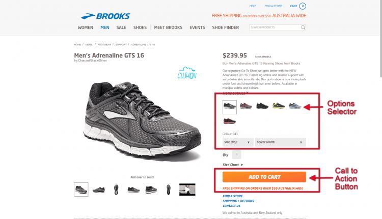
Options Selector
The buying area is a section of the product detail page containing all information required for a consumer to select the right product for purchase.
The buying area is meant to draw the consumer’s eye, making it obvious this is the primary action he/she is meant to take on the page. This is achieved with subtle shading or colouring of the background area.
The buying area contains the following content, listed in order:
- Product availability (in-stock message).
- Colour options (if required).
- Size guide (if required).
- Size options (if required).
Call to action Button
Since this is the primary desired action for this page, it’s worth sharing a few key characteristics of a successful ‘add to cart’ button:
- It is a contrasting colour to your site. (If your site is green, regardless of the “green means go” mantra, do not have a green button.)
- It is large (size matters).
- It draws the eye of the consumers, making it obvious what action he/she is supposed to take.
- It looks “clickable”, i.e. it’s not “flat”.
Section 4: Product Descriptions, Reviews, Delivery and Returns, Size Guide, if applicable.
Usually this section is located under the product image section. This section should be rich with content to satisfy those who are gathering information in the early stage of buying.
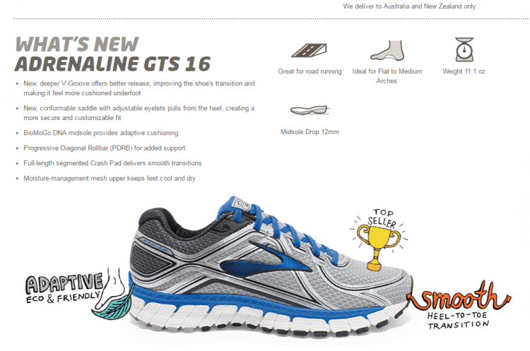
Product Descriptions
- Write benefits: When we sell our own products, we get excited about features and specifications. We live and breathe our company, our website, and our products.
The problem is our potential buyers aren’t always as interested in mundane features and specs – they want to know what’s in it for them. That’s why you need to highlight the benefits of each feature.
- Focus on your ideal buyer: When you write a product description with a huge crowd of buyers in mind, your descriptions become wishy-washy and you may end up addressing no one at all.
The best product descriptions address your ideal buyer directly and personally: you ask and answer questions as if you’re having a conversation with them, and you choose the words your ideal buyer uses.
- Make your description scannable: Packaging your product descriptions with a clear, scannable design makes them easier to read and more appealing to potential customers.
Here are some areas to focus on when designing yours:
- Entice your web visitor with headlines
- Use easy-to-scan bullet points
- Include plenty of white space
- Increase your font size to promote readability.
Customer Review:
Although many online stores do not allow for customer reviews, your store should. Many people even search for product reviews, so your review page could also help your rankings in search results. Having customer reviews on your site will also help to keep a potential customer on your site rather than them having to go elsewhere.
If you allow reviews of your products, it shows you are trustworthy and honest. Having real people reviewing the product helps put the minds of potential customers at ease.
Customer reviews also provide fresh, unique content for search engines. Including user generated content such as reviews can greatly help a product page stand out from other ecommerce stores.
Delivery and return tab
Delivery info: It is okay if it’s the same message throughout the site, as this is keeping the consumer on the page. It’s also important for all delivery information to be listed, including the costs for all regions.
Tip: Mention the track and trace service if it is available. This is a fantastic method to de-risk the purchase for potential customers.
Returns: This content also helps to de-risk the purchase, and is important to include on the product detail page. It does not matter if it is the same content site wide.
The time period of returns is also relevant, so place this information in a relevant position to compliment the buying process.
Section 5: Upsell Section:
Upselling is a sales technique where you offer your customers the chance to purchase upgrades (better features, better specifications, more volume) or to get the more expensive version of what they’re buying so you can maximise the value of their purchase (higher price).
The idea is to make the customer spend more money they originally thought they’d spend.
This section is usually at the bottom of the page and is perfect for displaying upsell opportunities such as ‘Complete the look’, ’You may also like this’, ‘Recently Viewed products’ etc. You can combine elements and tailor this section carefully based on the type of your business.
Conclusion
After this long guide, I hope you understand the importance of product detail page for your ecommerce store.
If you have never thought about improving your product detail page as a way to improve your company’s revenue, then it’s time for you to start thinking and get doing.
Give it a try.
However, you need to remember that the key to improving product page is to add value to your customer’s life.
If you need a professional help in improving your product detail pages, 23 Digital can help you with strategy and content.