Shopify design inspiration
Best-Looking Australian Shopify Stores: 21 Ecommerce Design Examples
A mobile-friendly guide to standout Australian ecommerce stores and the design patterns worth borrowing for your next Shopify redesign.
Key takeaways
- The best Shopify stores combine brand storytelling, mobile-first UX, fast product discovery and clear conversion paths.
- Strong ecommerce design is not about copying another store. It is about borrowing repeatable patterns that suit your brand and customers.
- Australian shoppers expect clear delivery, returns, reviews, payment options and local fulfilment confidence close to purchase points.
- This version is structured as stacked mobile-friendly cards, so screenshots, lessons and takeaways are easy to scan on phones.
Looking for Shopify web design inspiration with an Australian lens? This curated guide highlights standout Australian ecommerce stores and the practical design patterns worth borrowing for fashion, lifestyle, retail, beauty, gifting, homewares and purpose-led brands.
The aim is not to copy any store directly. The commercial opportunity is to identify repeatable patterns: stronger visual hierarchy, sharper navigation, better trust cues, more confident merchandising and a smoother mobile-first path to purchase.
What makes a Shopify store look great in 2026?
The best-looking stores are no longer just visually polished. They combine brand storytelling, speed, accessibility, product discovery and conversion clarity. For Australian retailers, that also means local fulfilment confidence, clear delivery messaging, Afterpay-style payment expectations, customer reviews and a brand voice that feels authentic rather than templated.
- Mobile-first layouts with clear tap targets and simplified product journeys.
- Editorial imagery that gives products context, not just catalogue visibility.
- Navigation built around how customers shop: occasion, routine, lifestyle, problem or category.
- Trust signals close to conversion points, including reviews, delivery, returns and product proof.
- A consistent design system that helps content, product cards and promotions feel connected.
Practical tip
When reviewing these examples, focus on the design pattern behind each store. Ask what helps the shopper move faster, trust the brand sooner or choose the right product with less effort.
Best-looking Australian Shopify store examples
Below are 21 Australian Shopify website design examples, each with a local screenshot reference and a focused design takeaway for ecommerce teams planning a redesign, migration or conversion-rate optimisation roadmap.
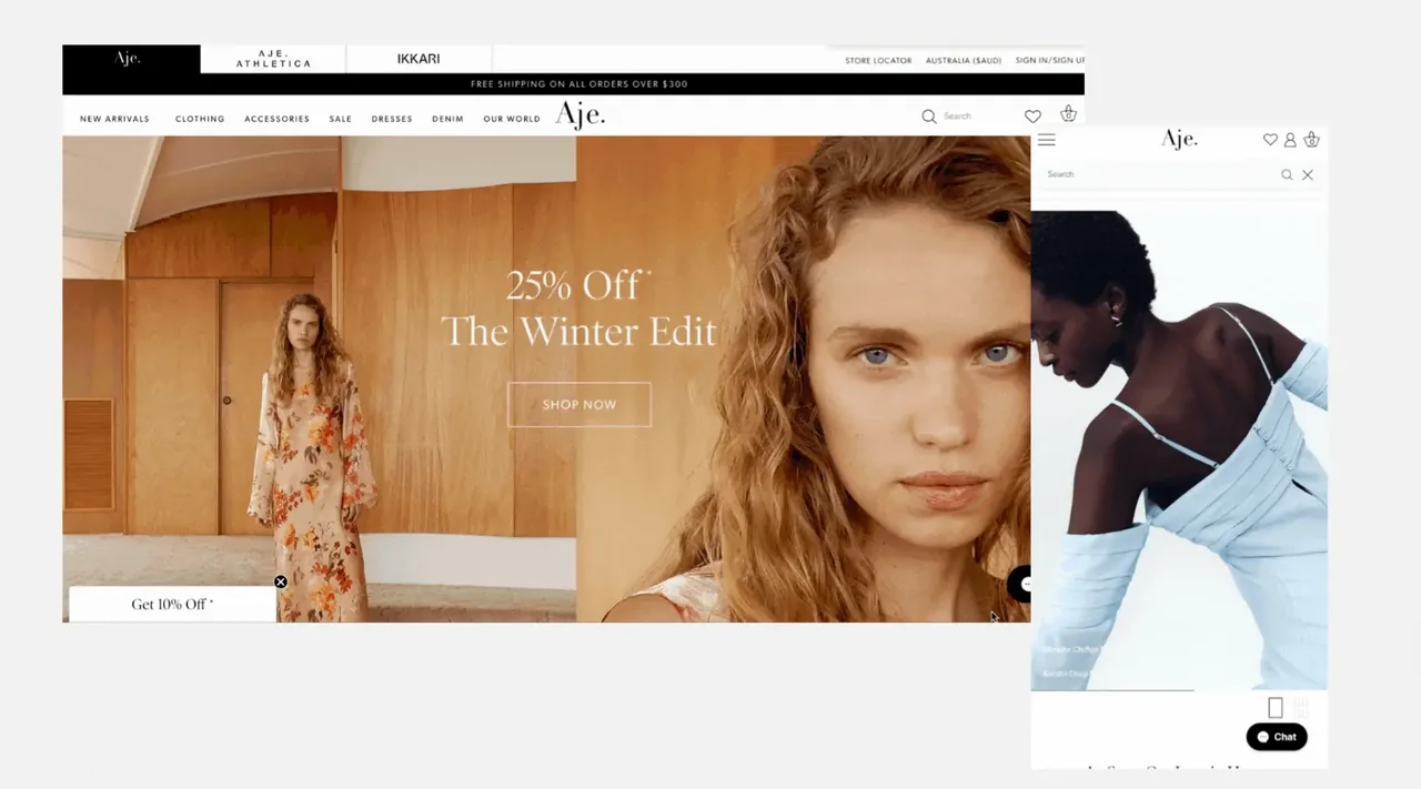
01. Aje
Why it stands out: A polished fashion experience that balances large campaign visuals, refined spacing and conversion-led modules without losing the brand’s premium energy.
Design lesson: The strongest cue is restraint: the store lets product, movement and collection storytelling do the heavy lifting, while navigation stays intentionally quiet.
What to borrow:
- Lead with campaign-grade visuals
- Keep premium navigation minimal
- Use video or motion to make collections feel current
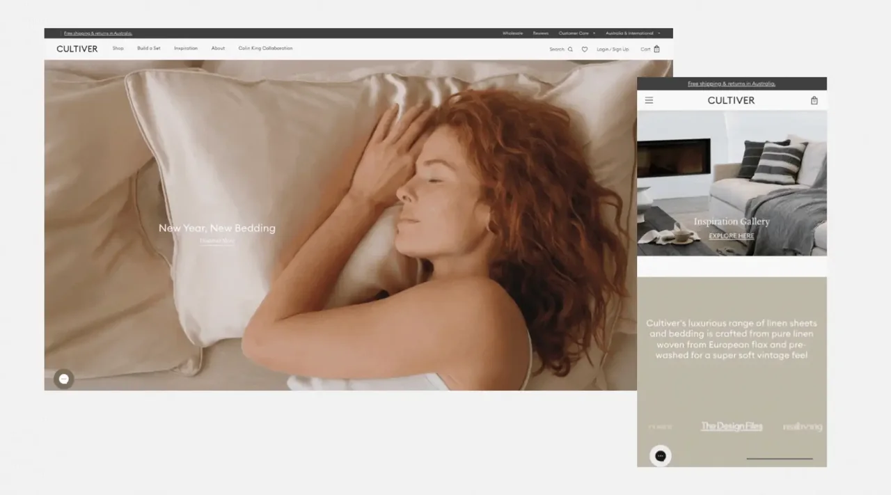
02. CULTIVER
Why it stands out: CULTIVER turns bed linen into an aspirational design system: soft photography, calm type hierarchy and generous whitespace create a tactile, premium shopping mood.
Design lesson: It is a useful reference for brands selling texture, comfort or material quality online, because the visual language feels more like a design journal than a catalogue.
What to borrow:
- Use neutral palettes to signal confidence
- Show texture close-up
- Pair editorial lifestyle imagery with simple product paths

03. Who Gives A Crap
Why it stands out: A masterclass in making everyday essentials memorable through colour, wit and a clear sustainability proposition.
Design lesson: The store proves that functional products do not need bland UX. Its playful creative makes replenishment feel like a brand relationship rather than a commodity purchase.
What to borrow:
- Make the value proposition instantly visible
- Use copy as a conversion asset
- Design recurring purchase paths clearly
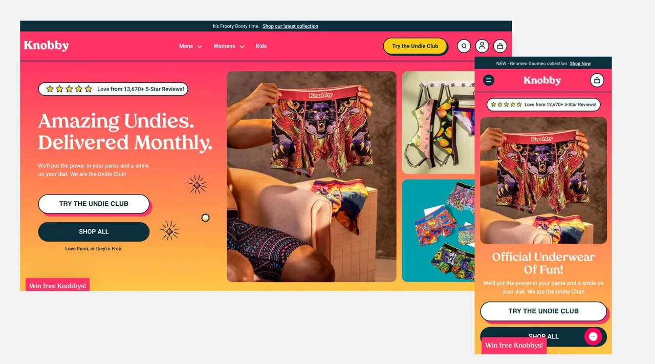
04. Knobby
Why it stands out: Knobby uses energetic visuals, product bundles and subscription cues to make underwear feel collectible and community driven.
Design lesson: For subscription brands, the design lesson is to sell the rhythm of membership as much as the product itself.
What to borrow:
- Merchandise subscriptions as a lifestyle
- Use user-generated style cues
- Bring bundles and frequency forward
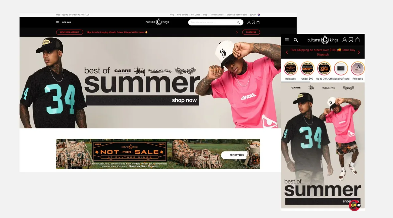
05. Culture Kings
Why it stands out: Culture Kings feels more like a digital flagship than a standard catalogue, with rapid product discovery, promotional intensity and streetwear culture baked into the interface.
Design lesson: It is particularly useful for larger SKU retailers that need to combine brand heat, filtering, scarcity and mobile-first browsing.
What to borrow:
- Design navigation for high-SKU discovery
- Promote drops and exclusives clearly
- Use personalisation and product density carefully
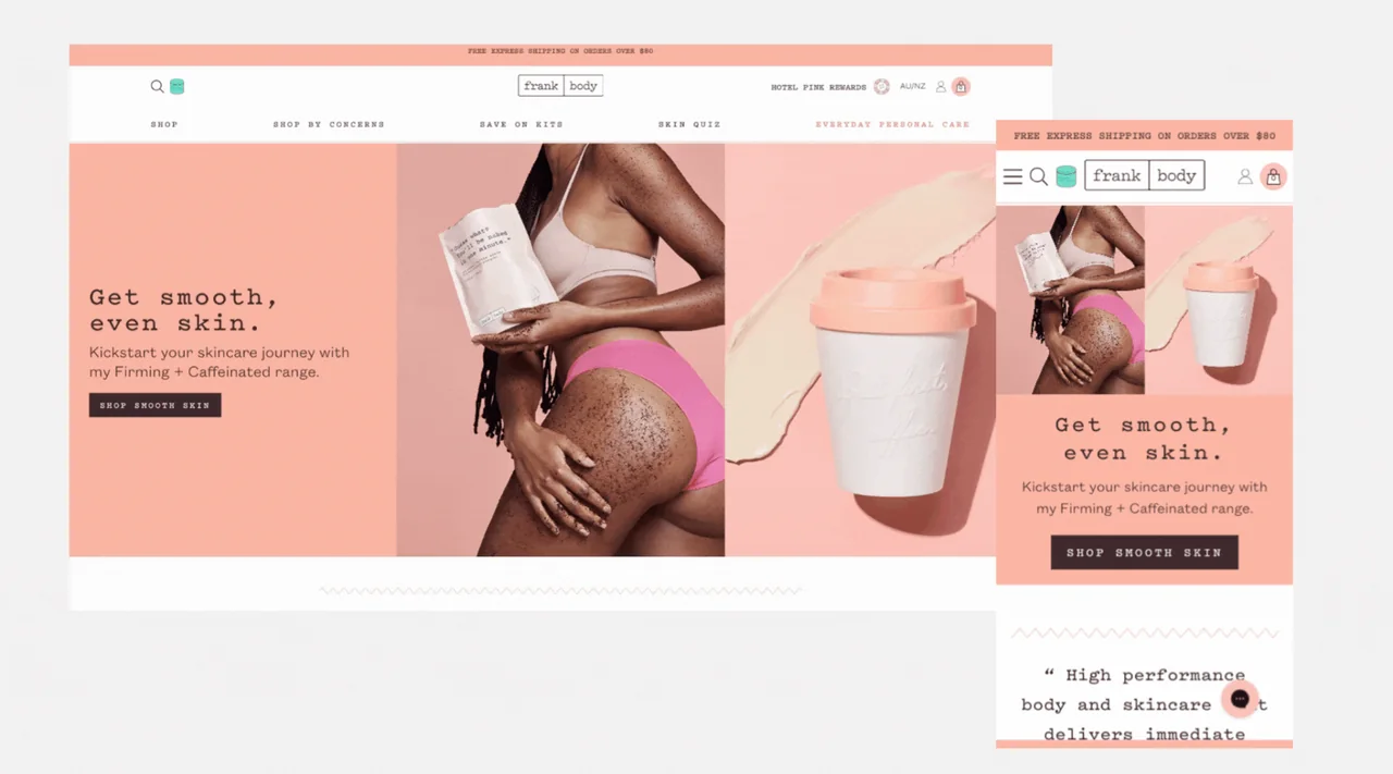
06. Frank Body
Why it stands out: Frank Body keeps the tone conversational while using education, reviews and loyalty prompts to lower friction for skincare shoppers.
Design lesson: It shows how a distinctive brand voice can coexist with practical product guidance, bundles and social proof.
What to borrow:
- Use brand voice consistently
- Surface routines and product education
- Blend UGC with conversion modules
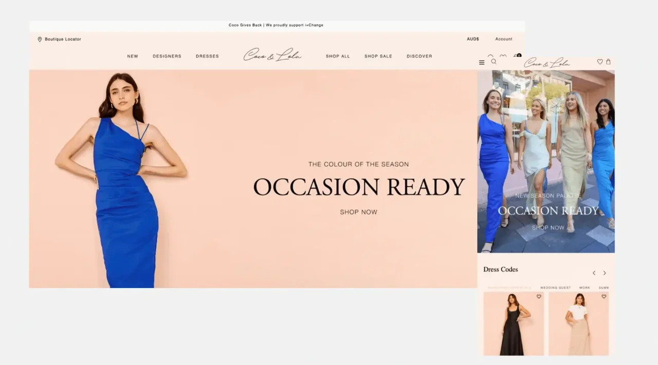
07. Coco & Lola
Why it stands out: Coco & Lola uses elegant curation, occasion-led navigation and styling cues to help shoppers move from inspiration to outfit decisions quickly.
Design lesson: This is a strong pattern for fashion retailers where customers browse by event, mood and complete look rather than by product type alone.
What to borrow:
- Create occasion-led navigation
- Show complete-the-look styling
- Balance lifestyle content with conversion
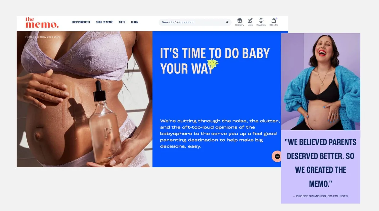
08. The Memo
Why it stands out: The Memo stands out because it makes a complex purchase journey feel calm, supportive and stage-aware for expecting and new parents.
Design lesson: Its best design pattern is empathetic segmentation: users can shop by stage, need and confidence level instead of being dropped into a generic grid.
What to borrow:
- Segment by customer life stage
- Use advice content as UX
- Reduce choice paralysis with curated pathways
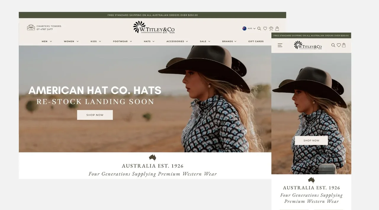
09. W. Titley & Co
Why it stands out: A practical example of modernising a heritage retail experience with smarter navigation, predictive search and stock-status confidence.
Design lesson: The site is valuable inspiration for brands with deep category depth, regional audiences or legacy retail trust to translate online.
What to borrow:
- Invest in mega-menu logic
- Use predictive search for deep ranges
- Make availability and fulfilment clear
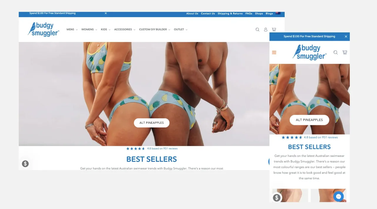
10. Budgy Smuggler
Why it stands out: Budgy Smuggler leans into humour, customisation and national identity, creating a distinctive storefront that is hard to confuse with anyone else.
Design lesson: It is a reminder that strong design is not always minimal. Sometimes memorability, cheek and participation are the commercial levers.
What to borrow:
- Let brand personality lead
- Make custom products easy to start
- Use competitions and community for repeat engagement
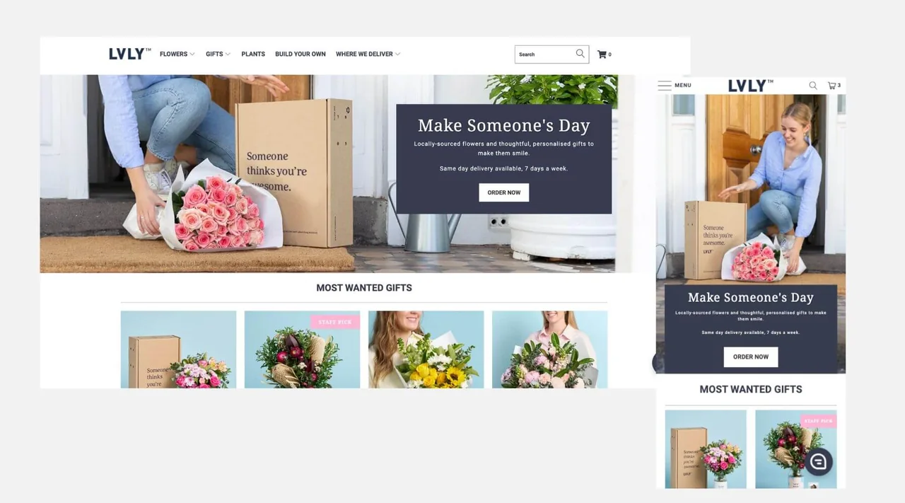
11. LVLY
Why it stands out: LVLY keeps gifting emotional and frictionless, with bright visuals, personalisation options and delivery confidence built into the journey.
Design lesson: For gift-led ecommerce, the lesson is to design around the recipient, message and occasion rather than treating the item as a standalone SKU.
What to borrow:
- Design by occasion
- Promote same-day or timed delivery clearly
- Make personalisation prominent
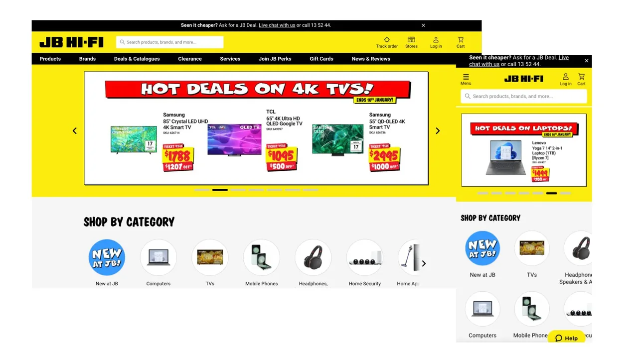
12. JB Hi-Fi
Why it stands out: JB Hi-Fi demonstrates how a high-traffic, price-sensitive retail experience can keep deals, categories and search highly visible.
Design lesson: It is a useful benchmark for transactional clarity: users arrive with intent, so the interface prioritises fast discovery, offers and availability.
What to borrow:
- Keep search prominent
- Design deal pathways for speed
- Use strong category signposting
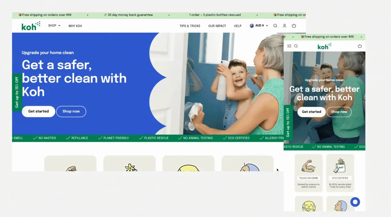
13. Koh
Why it stands out: Koh uses clean visuals, review-led reassurance and educational content to make sustainable cleaning feel simple and credible.
Design lesson: It is a strong reference for brands that need to explain efficacy, sustainability and usage without overwhelming the shopper.
What to borrow:
- Combine proof with education
- Make starter kits obvious
- Use clean layouts to reinforce product promise
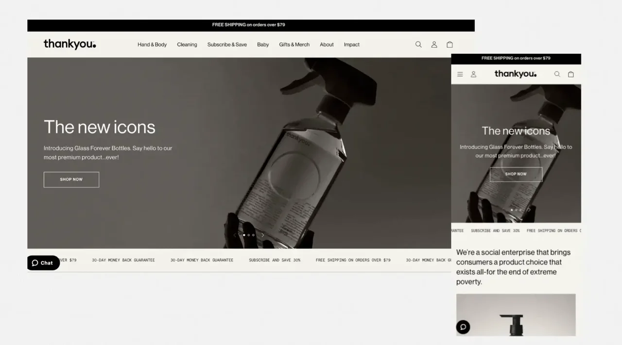
14. Thankyou
Why it stands out: Thankyou places mission, product and trust in a stripped-back experience that feels intentional rather than under-designed.
Design lesson: Purpose-led brands can learn from the clarity: impact storytelling must be easy to understand, but it still needs to move users towards action.
What to borrow:
- Lead with mission in plain language
- Avoid clutter around impact claims
- Make product and purpose mutually reinforcing
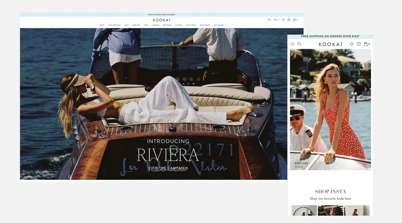
15. KOOKAI
Why it stands out: KOOKAI keeps the experience polished with clean navigation, aspirational product imagery and a confident purchase flow.
Design lesson: This is a good reference for brands that need to feel editorial but still support quick browsing, sizing and checkout decisions.
What to borrow:
- Prioritise crisp imagery
- Keep product pathways elegant
- Use restraint to maintain premium positioning
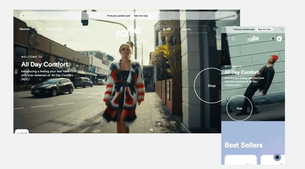
16. Rollie Nation
Why it stands out: Rollie Nation’s experience is built around comfort, colour and fit confidence, with smart guidance patterns that reduce returns and hesitation.
Design lesson: Footwear brands should pay close attention to quizzes, fit education, reviews and comparison cues because they directly de-risk conversion.
What to borrow:
- Use fit guidance as a sales tool
- Let colourways feel discoverable
- Use quizzes to personalise product discovery
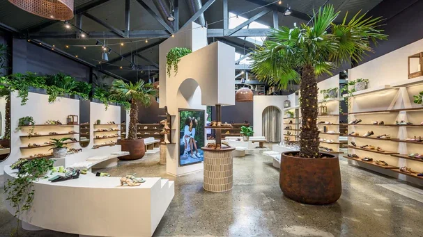
17. Bared Footwear
Why it stands out: Bared Footwear blends ecommerce and retail operations in a way that makes product, fit and service feel consistent across touchpoints.
Design lesson: It is a strong example for merchants that need online conversion and in-store operations to behave like one commercial ecosystem.
What to borrow:
- Design for omnichannel service
- Make fit and comfort proof visible
- Connect online merchandising with store operations
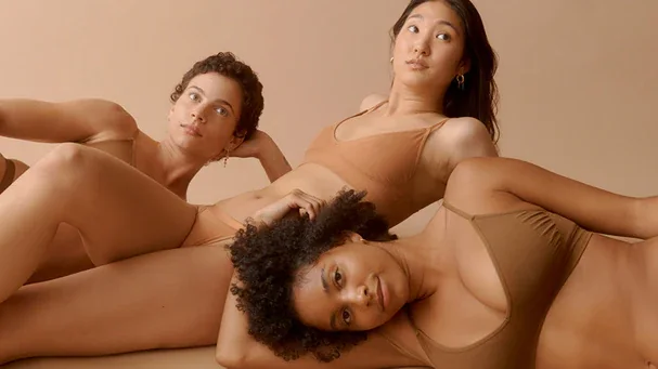
18. Boody
Why it stands out: Boody’s design balances soft basics, sustainability credentials and simple purchasing, giving commodity-adjacent apparel a premium ethical frame.
Design lesson: The key inspiration is clarity. The brand makes comfort, material and responsible production part of the commercial story, not an afterthought.
What to borrow:
- Make sustainability commercially tangible
- Keep basics easy to replenish
- Use soft visual systems for comfort-led products
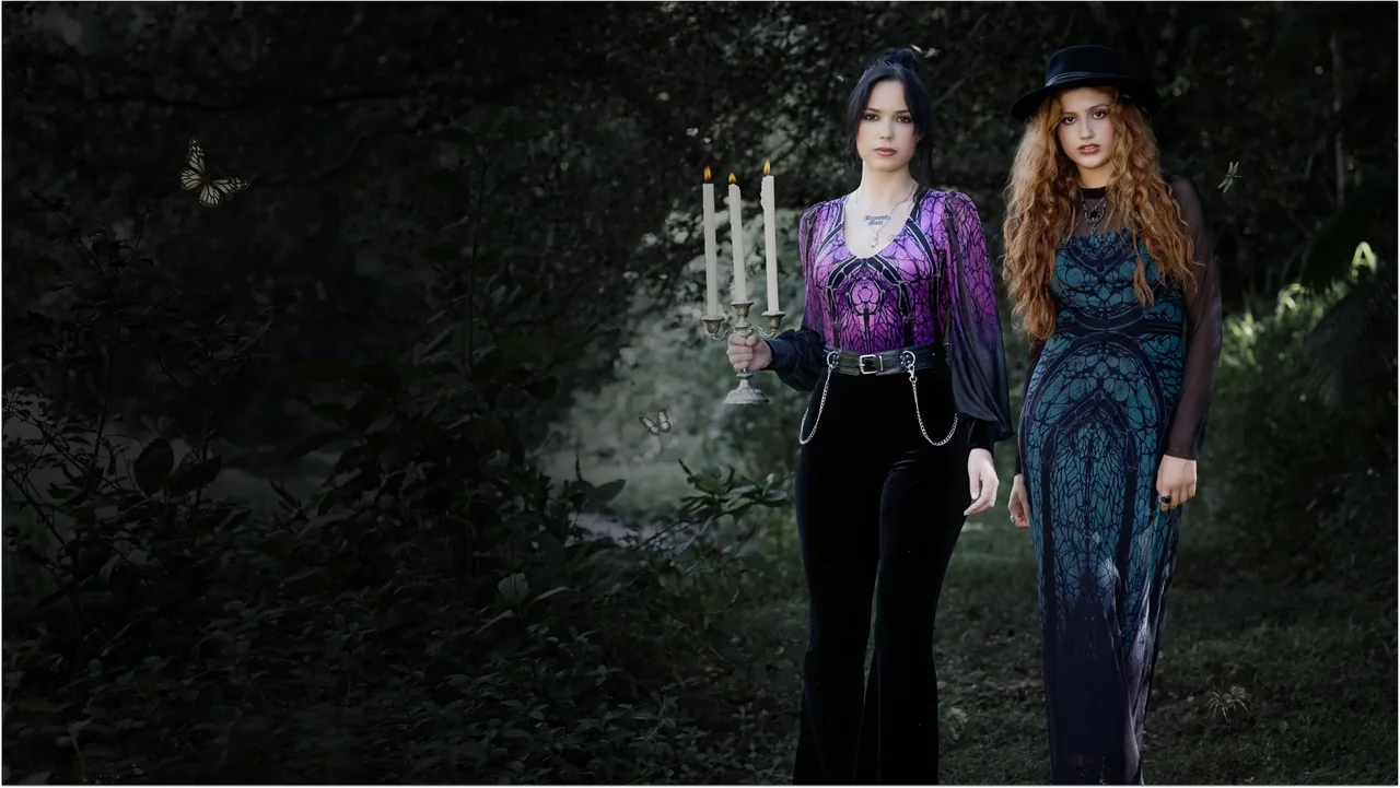
19. BlackMilk Clothing
Why it stands out: BlackMilk uses bold campaign worlds, limited-run energy and community language to make browsing feel closer to a drop culture event.
Design lesson: It is an excellent reference for brands where community, fandom or niche identity are central to the purchase decision.
What to borrow:
- Build product pages around community identity
- Use campaign launches as events
- Let photography carry the subculture

20. Modibodi
Why it stands out: Modibodi’s experience is strongest where it simplifies a highly considered category through education, trial reassurance and clear product benefits.
Design lesson: For sensitive or problem-solving products, the design principle is confidence: explain how it works, show proof and remove perceived risk.
What to borrow:
- Use education above and within product journeys
- Make guarantees easy to find
- Segment by use case, absorbency or customer need
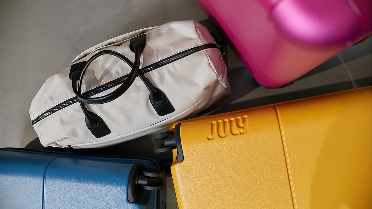
21. July
Why it stands out: July presents luggage as a design-led travel system with clean product architecture, confident comparison cues and a polished premium feel.
Design lesson: The store is useful inspiration for brands with configurable products, accessories and cross-sells that need to feel elegant rather than busy.
What to borrow:
- Build a product system, not isolated SKUs
- Use comparison to support considered purchases
- Keep premium travel imagery purposeful
Design patterns Australian ecommerce teams should take forward
Premium brands
Invest in photography, content pacing, refined whitespace and a checkout journey that feels calm. Luxury ecommerce should feel considered, not slow.
High-SKU retailers
Prioritise search, filters, merchandising rules, promotional surfaces and availability cues. Discovery architecture becomes the brand experience.
Purpose-led brands
Translate values into proof: impact metrics, materials, guarantees, education and post-purchase confidence should sit close to conversion moments.
Subscription and replenishment brands
Make frequency, bundles, savings and flexibility highly visible. The product page must sell the operating model, not just the first order.
Gift-led brands
Design around the recipient, occasion, delivery timing and personalisation. Emotional certainty is as important as product detail.
Worth knowing
Mobile-friendly ecommerce design is not only about responsive resizing. It is about reducing friction: fewer taps, clearer product choices, stronger proof and a faster path to checkout.
A strong Shopify redesign should not copy these stores. It should borrow the right patterns, adapt them to your category and turn them into a faster, clearer buying experience.
Related reading: WooCommerce vs Shopify Australia Tax Settings: GST Guide 2026